Responsive Site
What a responsive site is? Why responsiveness is important?
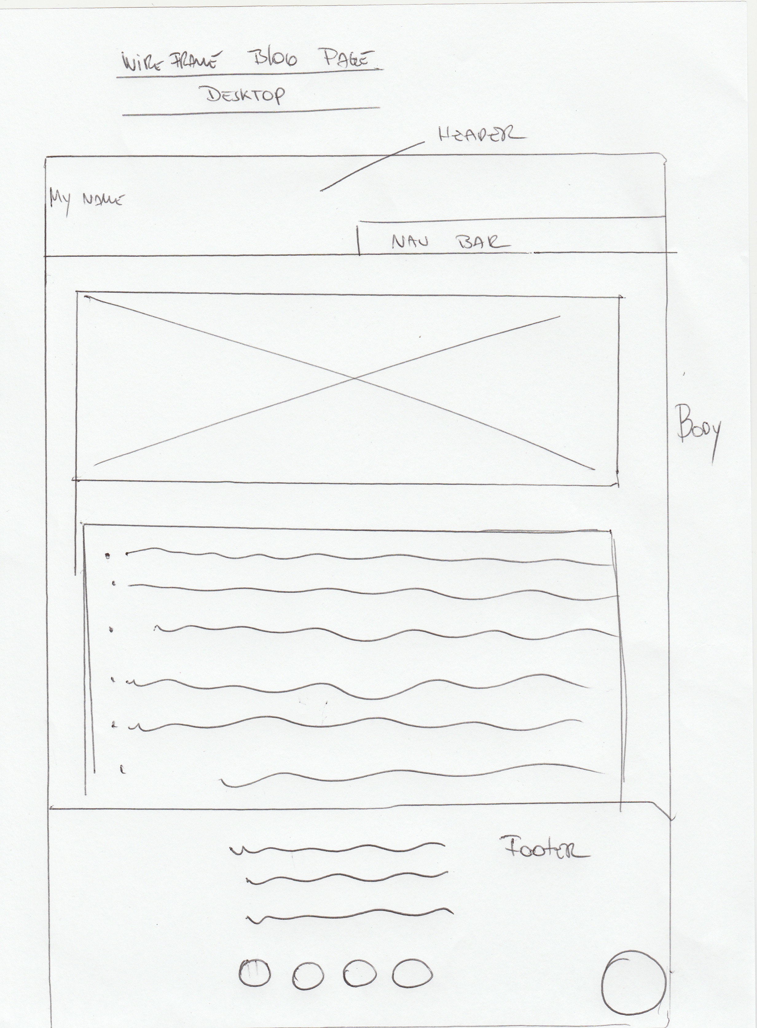
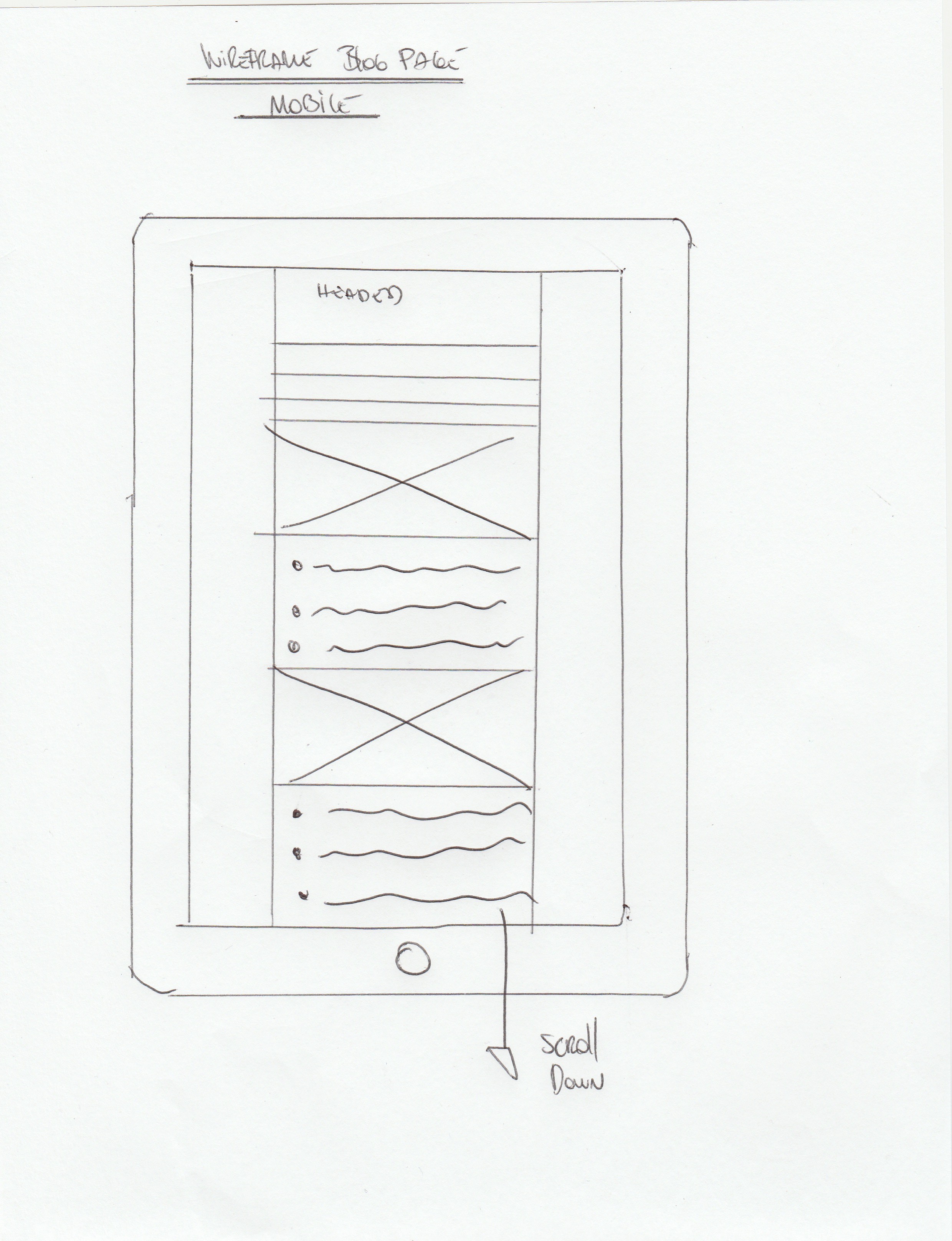
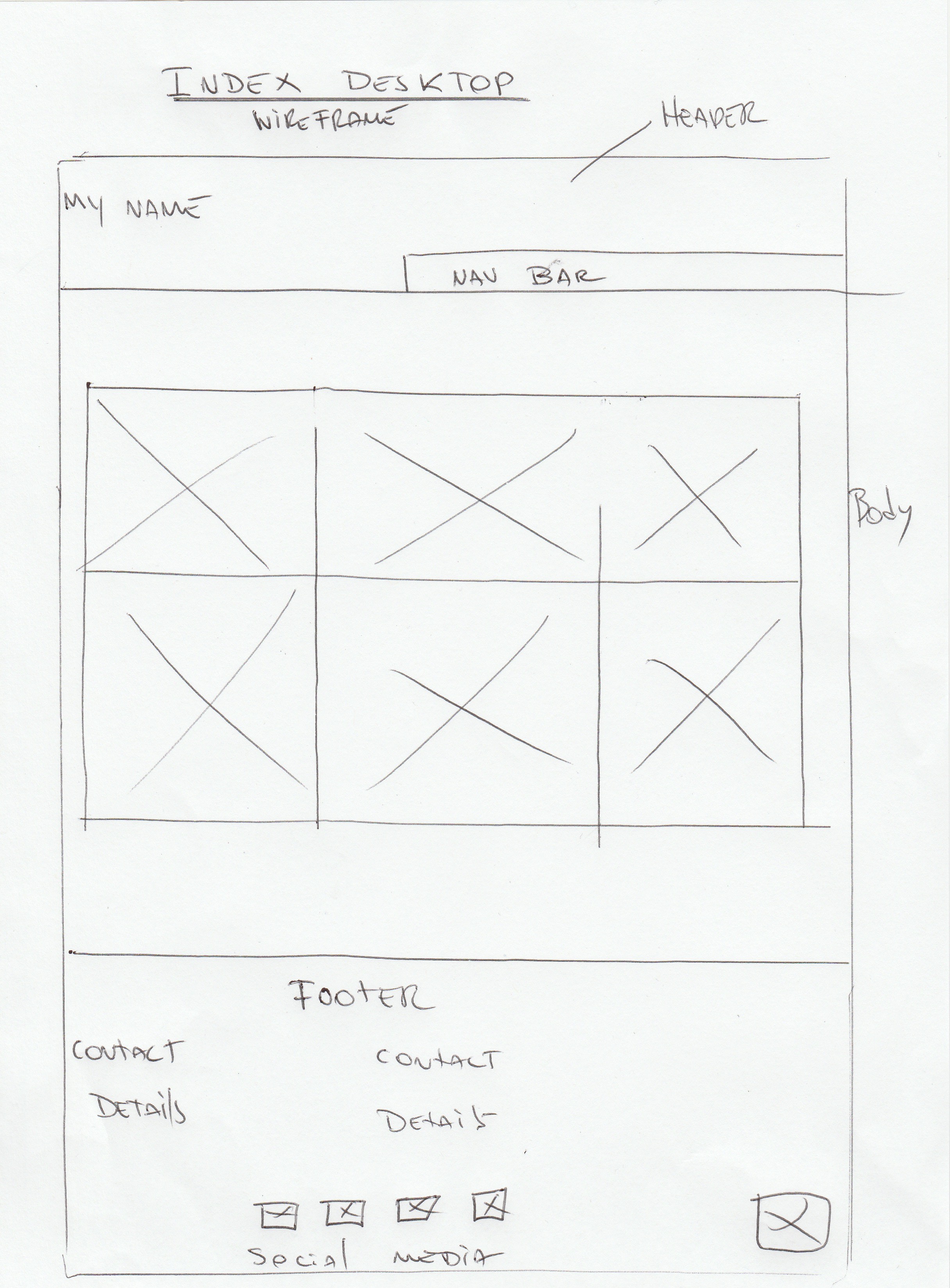
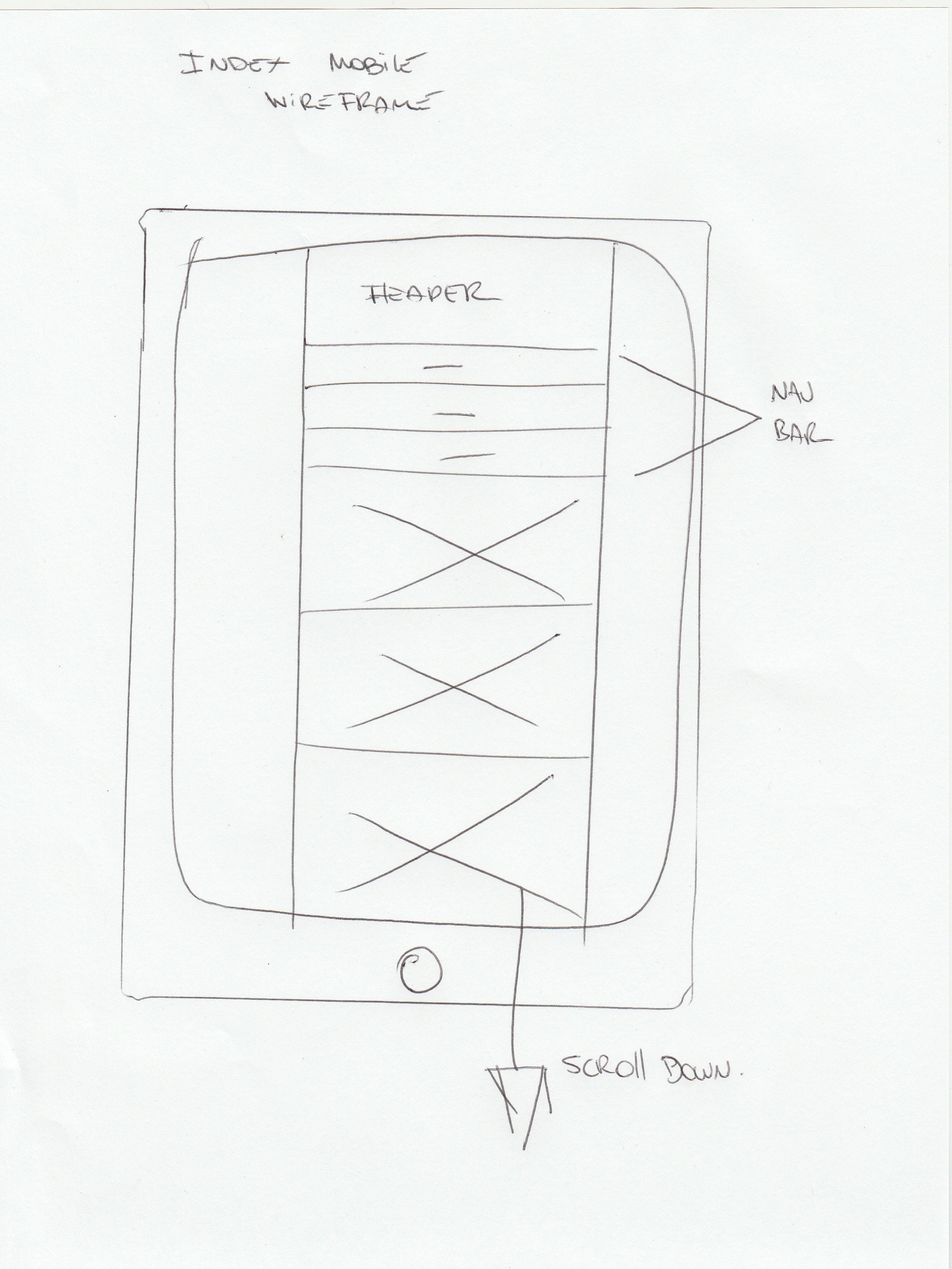
Responsive web design allows site layouts to change the screen content depending on the screen size. A wide screen display can receive a site design with multiple columns of content, while a small screen can have that same content presented in a single column with text and links that are appropriately sized to be read and used on the smaller display.
Responsive websites are very high in the market because all devices have different screen sizes eg. cell phone, tablet, laptop etc. Responsive websites are popular because they can be operated on any device.
What mobile first design is? Why is it important?
Mobile first design refers to designing the website while keeping the mobile view in mind, instead of designing it for desktops and larger screens. It is important because more people are getting cellphones instead of computers, therefore mobile first design is a priority.
What frameworks are? What are their pros and cons.
A CSS framework is a piece of software that has a lot of options for you to use in your HTML development, potentially making it faster and easier for you to develop your website or web app. A CSS framework does this by containing predefined libraries of code. One example is a grid-based framework which sets up a multi-column arrangement with predefined pixel widths so you can focus on creating content instead of lining up blocks of text.
Pros: Gives you clean and symmetrical layouts, enables cross-browser functionality, speeds up your development and enforces good web design habits.
Cons: Forces you to use the frameworks semantics and you could potentially lose time if you are not familiar with CSS frameworks.
What a wireframe is? Why we use it?
Wireframes are simple black and white layouts that outline the specific size and placement of page elements, site features, conversion areas and navigation for your website.
Building a simple wireframe will save time in the long run and ease the development process for the designer, developer, and client.


